The Gallery
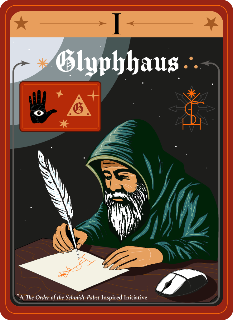
Glyphhaus
Case Study No. 004
Project by Glyphhaus
Client: Knight&Day Vegan Food
Year: 2019
Deliverable: Label design and concept for packaging. Illustrated marketing poster for start-up convention.
Got a strange, beautiful, or unruly vision? Good. We do our best work in the margins.
Jump to → Client · Intervention · Glitches · Tools · Impact

“make vegan punk”
The Sauce Rebellion
Knight&Day Vegan Products LLC — Portland, OR, USA
1. Client Situation
Knight&Day, a vegan sauce startup with a punk ethos, wanted packaging that would spark conversation in grocery aisles about vegan food while attracting vegans and non-vegans alike. Their product was bold — but their visual identity played it safe.
One caveat:
“Yes, we are Punks, not Hippies! Yet we want our sauce to be loved by everyone.”
2. Our Intervention
Glyphhaus embraced the audacious spirit of Knight&Day, infusing their label with a visual style that is playfully professional, yet still keeps the punk DIY approach alive. We crafted a design that is as bold as the flavors within, yet inviting to all who dare to explore.
The packaging is a standard, mass-produced bottle, but with a custom-made light pink cap. The result is a visual identity that stands out on the shelves, sparking curiosity and conversation among vegans and non-vegans alike.
By balancing edge with inclusivity, Glyphhaus ensured that Knight&Day's sauces are not just seen, but accepted by everyone.
3. The Glyphs & Glitches - A2 Poster (Print + Web)
Promo Poster:
Bottle with pink cap, bold slogan “FISH KILLED TO MAKE THIS SAUCE: 0” Clear, cheeky, and impossible to miss. Designed for print and public provocation.
Bottle Label:
Front label featuring circular wave glyph and friendly typography, familiar like a grocery list, not a sermon. It ironically balances DIY ethos with FDA-flavored professionalism. Algae gone pop!
Color Accent:
Custom cap: Punk, but with manners.
4. Tools & Tech
Illustrator / Obsidian / GPT-4 / a huge box of vegan products
5. Impact
A vegan café in Hamburg used the poster as bathroom art. A retired fishmonger reportedly made the switch. Maybe.
6. Who Helped
Nome – For visual historical research and wave glyph development
Vela – For voice-of-brand and copy tone
Arthur – Poster design, label layout, typographic detailing, and cap concept, also heavy sauce user.