The Gallery
Glyphhaus
Case Study No. 001
Project by Glyphhaus
Client: Ananta Yoga Collective
Year: 2018
Format: A2 Poster (Print + Web)
Design for yoga doesn’t need to whisper or float. Sometimes it stands on its head and speaks plainly.
Jump to → Client · Intervention · Glitches · Tools · Impact
“spiritual alignment kit”
Ananta Yoga Collective— Portland, OR, USA
1. Client Situation
Ananta Yoga Collective teaches post-lineage yoga with an inclusive, trauma-informed approach. Their retreats focus on embodiment over achievement — no gurus, no gimmicks. They commissioned a bold yet meditative poster that could work both in studio windows and online spaces.
One caveat:
“No floating monks or lotus clichés. It should feel grounded and alive.”
2. Our Intervention
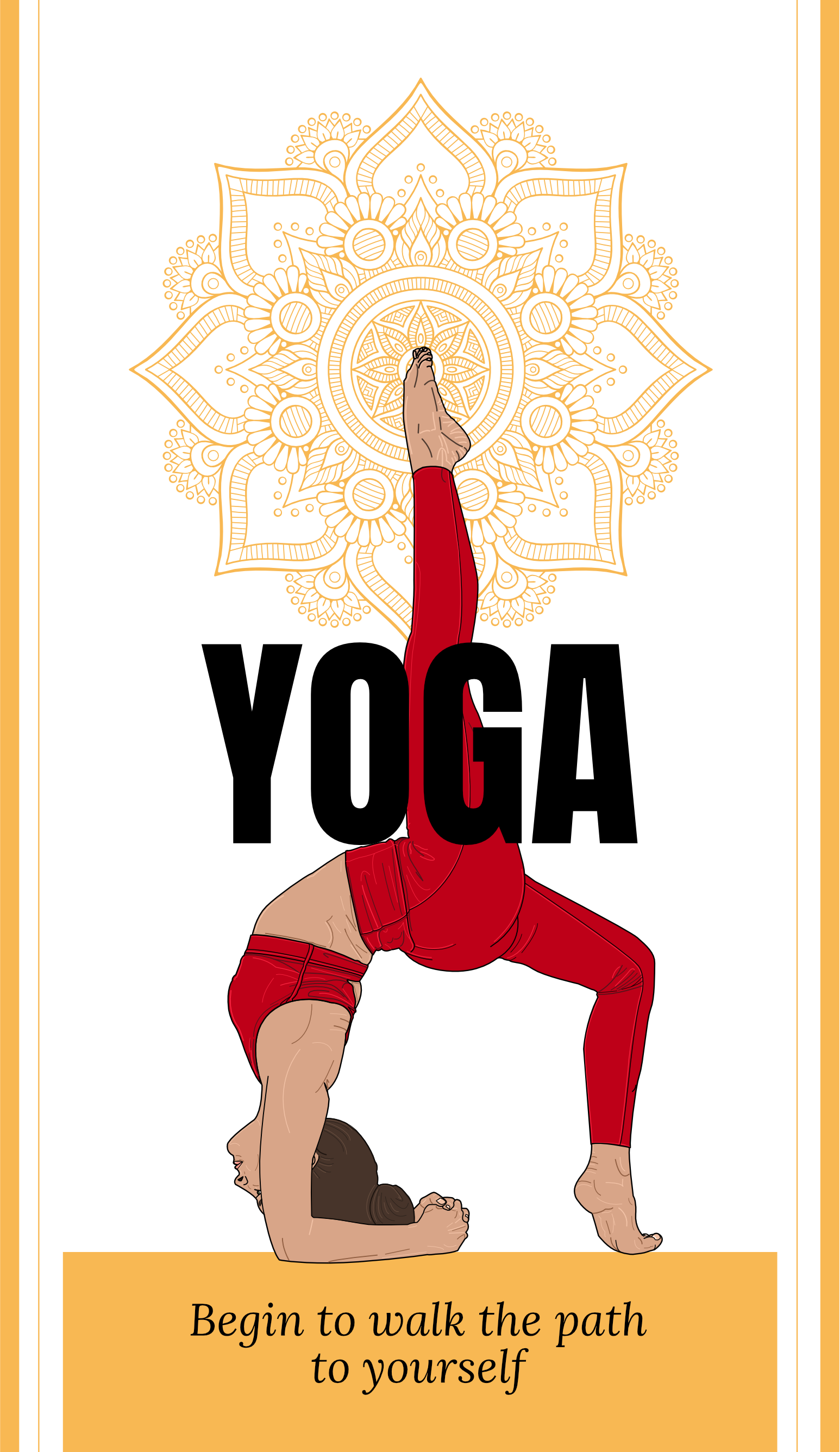
Arthur developed a composition where symmetry and strength meet softness. A precise vector illustration anchors the figure in gravity, while the background mandala alludes to inner complexity without spiritual posturing.
The headline — “YOGA” — is unapologetically large and centered, cutting through the noise with quiet force. The subline, set in a warm serif, offers a subtle invitation:
Begin to walk the path to yourself.
3. The Glyphs & Glitches - A2 Poster (Print + Web)
Image
Strong, grounded figure beneath stylized mandala. The figure’s feet and elbows form a grounded triangle. Power without strain.
Typography
YOGA (uppercase, centered, intersecting the body)
Treated as both word and symbol — clarity becomes presence.
Color Story
Amber, deep red, ivory
Root chakra meets autumn. Earth tones, not esoteric hues.
4. Tools & Tech
Illustrator / Obsidian / GPT-4 / a printed yoga mat from Aldi
Vector precision, but always human-scaled.
5. Impact
The poster stood out in crowded wellness centers and community boards. Teachers reported new students saying, “I felt really invited by the poster.” Retreat bookings increased. One person reportedly joined because the type “just felt safe.”
6. Who Helped
Greeblin– Helped with choosing the right font and legibility across formats
Flux – For visual calm and organic spacing
Arthur – Art direction, illustration, layout, and mantra composition